Overview of the New Features for Bootstrap 4
Bootstrap is a powerful HTML & CSS front-end framework for building responsive websites. Bootstrap’s unsophisticated learning curve make it a great framework to master for beginner web developers, but encourages professional developers to consider taking a more native approach for bootstrapping a responsive website.
Ask any existing Bootstrap developer why they use the framework and they will happily answer, “It’s because of the convenient grid system, and implemented components.” — on top of being regularly maintained, Bootstrap sits comfortably as the leading responsive design framework you can get your hands on.
And now, Bootstrap is graduating from V3 to V4 — which is going to bring about a more refined approach for designing modern and responsive websites.
Since this is such a huge change in Bootstrap’s ecosystem, and it has taken place for more than 10 months already, it’s time we educate ourselves about the new changes that we can expect in Bootstrap 4.
Flexbox Support (Opt-in)
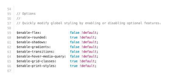
Developers creating for multiple device types can rejoice in the news that V4 is going to support Flexbox, but because not all browsers fully support it yet, to use Flexbox in V4 is going to be optional. The _variables.scss file contains a function called $enable-flex and is by default set to false. Developers can change that value to true and enjoy the framework’s capacity to switch your existing grids to Flexbox layout instantly.
Cards Content Containers
Mobile demand has led to a surge in unique design elements, one of which is Cards; a convenient design pattern used to display a set of information within small chunks. They’re a wonderful addition to mobile — and responsive — design.
Bootstrap 4 introduces native Cards component, which will replace the V3’s panels, wells, and thumbnails.

You can find the usage of cards design on popular social sites like Twitter,Pinterest, and weather forecast apps. Although cards isn’t an entirely new design pattern, the addition of cards to V4 will make them more accessible to those who mostly prefer to work with Bootstrap alone.
IE8 Terminated
The startling eye-opener is that IE8 enjoys a 6.20% market share in the global browser usage reports, but what’s more shocking is that this usage has remained consistent, even after Microsoft released Edge and cut the support for IE8+ browsers.
Bootstrap Dev Team isn’t having any of it, and the new V4 isn’t going to support IE8 at all. This means that, developers working with clients with a significant portion of visitors coming from IE8, are going to need to stick to V3 for the time being.
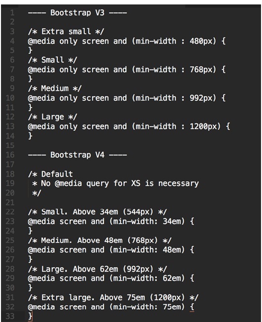
Changes to Media Queries
Bootstrap 4 is getting rid of the traditional pixel grid breakpoints, and is going to switch over to em completely. This will be an important transition, particularly for those who were used to using LESS with V3, since V4 is switching over to SASS.
You can learn about the pixel to em conversions from this table:

And here is a comparison between V3 and V4 values for media queries:
Bootstrap Theme Upgrades
Finding a good looking Bootstrap template isn’t so hard these days, a search on GitHub might return a wide selection of Bootstrap boilerplates, and so will a query on your favorite web design blog.
But, Bootstrap itself hosts three unique themes: an admin dashboard, a marketing agency template, and a web app design.
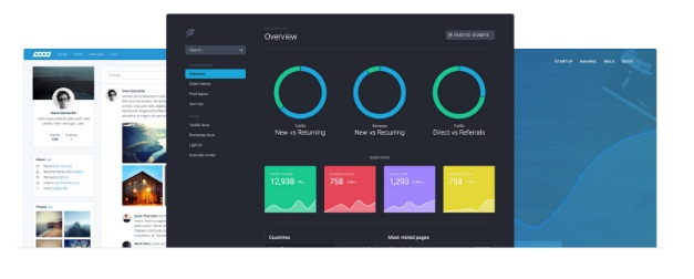
True, these themes are not free, yet they maintain such precise design quality that questioning the value of investment isn’t necessary. You can apply either of these templates to your client projects, and make a quick return on the investment.
All the official Bootstrap themes are going to get automatically updated to Bootstrap V4, some are already using elements from the upcoming official release.
Many More Exciting Features
We’ve given you a taste of what is yet to come, but both the Alpha 1 and Alpha 2 blog posts from Bootstrap’s development team are great resources for exploring more improvements made to the framework.
It certainly will change the way front-end developers approach responsive design, but change is what makes web development so exciting.
By: Alex Ivanovs (Guest Blogger)
 Alex Ivanovs has spent the last decade as an individual web development expert, sharing his experiences on platforms like Huffington Post, Benzinga, Shopify, and others. You can find more of his work on Colorlib, where he helps with managing the project growth.