How to Fix a Poor Layout in Graphic Design
A layout in graphic design terms is the art of manipulating user’s attention on an advertisement or a page to convey the meaning, points and sequence of interaction.
If the word ‘manipulating’ seems confusing to you, think about it this way – movie and television directors make their living by manipulating viewers’ attention in movies and on TV. In the same manner, editors manipulate your attention by arranging and re-arranging headlines in a magazine or a newspaper cover. The fact is that consumers of content spend just a split second deciding whether or not they want to read what’s placed in front of them. If your layout does not grab their attention, or god forbid they have to work to decipher its meaning, you’ve already lost your reader and they’ve moved on to something else. Formatting your layouts correctly can fix this issue.
Graphic designing might be an art, but there is more rationality to a good page layout than you think. Organization of the information that you want to have inside your layout is one of the most important aspect of graphic designing.
In this tutorial, we will take a look at different layouts and get to know why these are different and superior to their former versions. Let’s begin with the first layout – the flyer that act as an advertisement
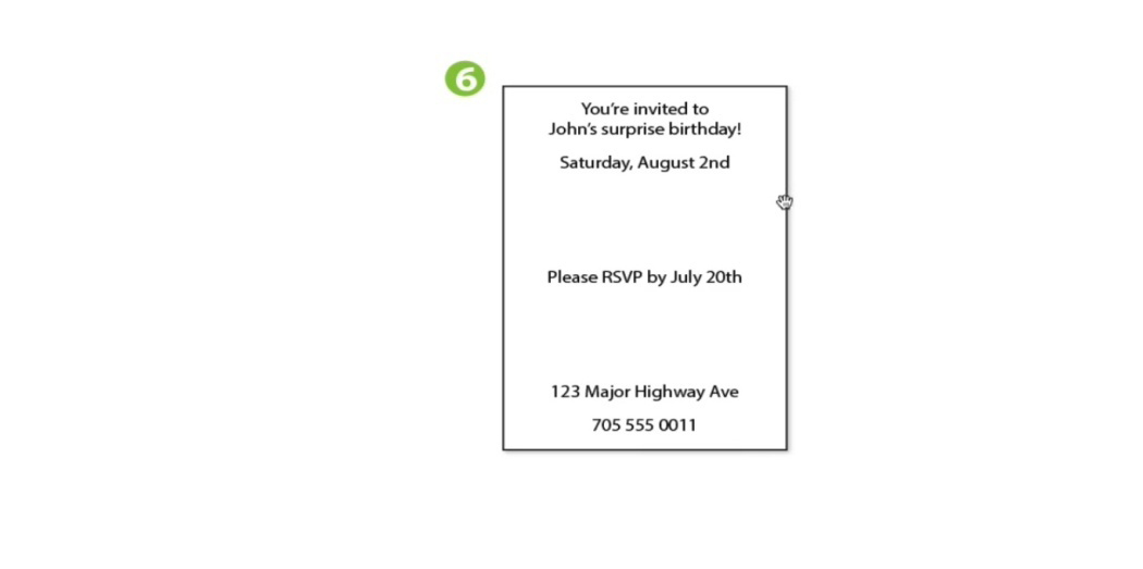
- The first layout
The first layout reads ‘123 major highway AVE’ on the top. The next information includes telephone number followed by ‘please RSVP by July 20th’ and the date. In the first look, it looks a rather disorganized list of information with hardly any correlation.
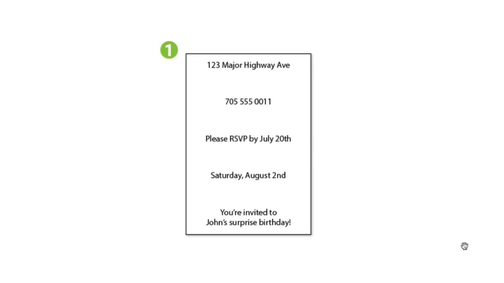
- The second layout
When we re-arranged the information, we got a layout that had the message ‘please RSVP by July 20th’ at the top followed by the address and the date of the event. At the bottom, the second layout had the message saying ‘you are invited to John’s surprise birthday party’ and the phone number.
The layout again had disorganized information.
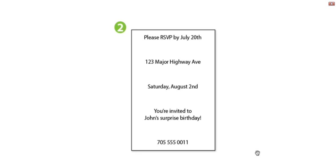
- The third layout
In the third layout, we restructured the information in a better way. The top message indicated the surprise birthday party of John. The next message was RSVP one, followed by address, date of the event and the telephone number. All the information was given and the reader was given the reason why should he care to read the advertisement. However the problem with this layout was that it had too many separate elements. It is always advisable to avoid having too many separate elements inside a single page. This takes us to our next layout.
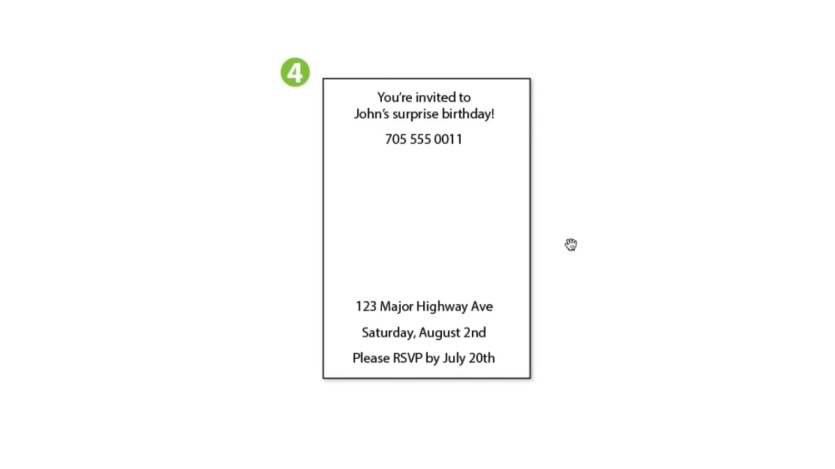
- The fourth layout
This layout includes same information but was categorized and divided into two equal parts. This gives the reader or viewer an instant visual reason to for an instant attention. This layout represents order and structure. The upper information is about the event and each element displays correlation. Same goes with the bottom message that includes address and phone number details of the event. But, can this layout be organized in a better way? Let’s see it in our fourth layout
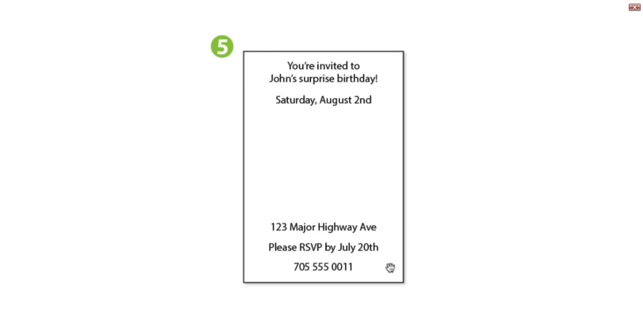
- The fifth layout
- In this layout, the information is arranged in a similar but more logical way. The elements include
- What the event is
- When the event is
- Where it is
- And some additional information
The structure of the information should be in order of most important piece of information at the top and the least important one at the bottom. If we talk about the pattern of your eye laid on this advertisement, it first reads the top then the bottom and then again reads the top information and then finally to the bottom again. This calls for a superior layout that better controls the eye movement of the viewer in a way we want it to be.
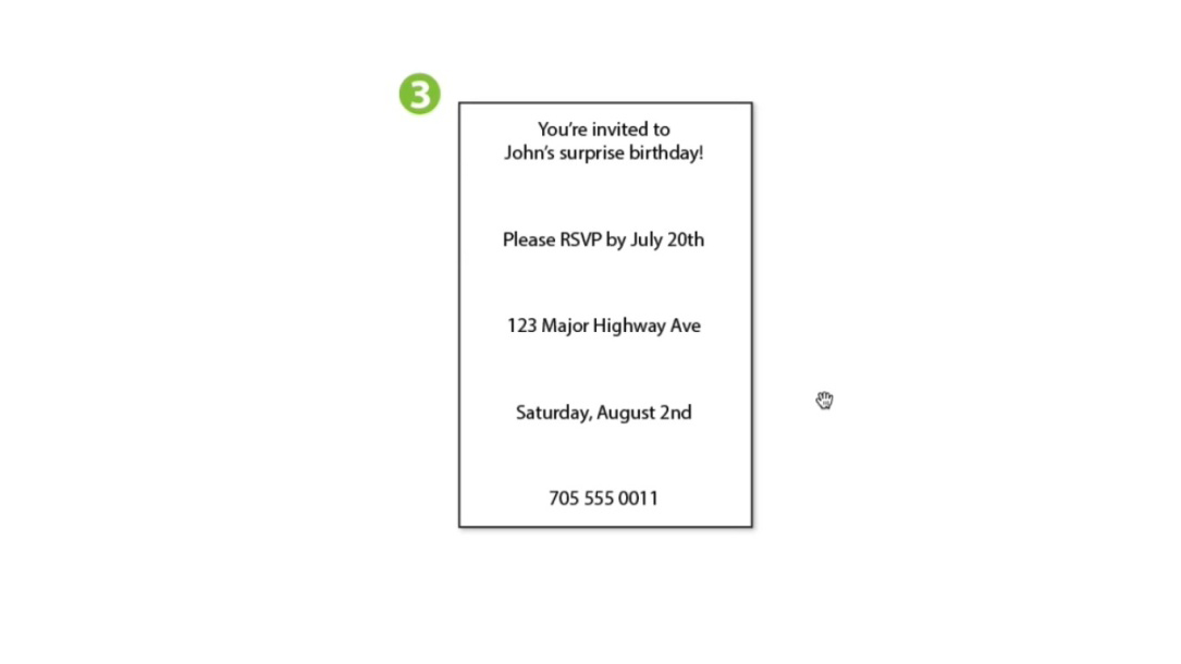
- The sixth layout
This layout contains the birthday invitation message on the top along with the date of the event. The RSVP message is positioned in the middle and the address and phone number stays at the bottom. As this is more structured information, the movement of eye is straight at the top first and then proceeds to the bottom of the page.